Showing posts with label KF8. Show all posts

September 26, 2012

The eBook Design and Development Guide - My Latest

After eight-months of toil, the eBook Design and Development Guide is finally published. I'm pretty proud of this one, since it includes some nice color-coded snippets and over 150 images. Here are some screen shots:


You can pick it up at Amazon for $6.99. Thanks so much.

While eBook sales continue to increase around the world, the actual layout and presentation of eBooks is in a sorry state. Mangled formatting, defective images, and non-reflowable content are just a few symptoms of the problem. Many publishing houses and independent authors believe that converting an eBook directly from Word, InDesign, or another publishing program will produce a “good enough” eBook. However, poor sales and poor reviews from readers suggests otherwise.

The eBook Design and Development Guide is a technical reference for serious publishers and authors who want to produce professional eBooks with a focus on quality. This guide provides all the technical knowledge of HTML, CSS, EPUB, XML, and KindleGen that is necessary to create your eBook from a source manuscript into an eBook ready for sale at all the major eBook vendors, including the Amazon Kindle Store, Barnes & Noble Nook, Kobo, and the iBookstore.

No prior experience is required and the process of eBook production requires no expensive third-party software. This guide will teach you how to master the following tasks:

  • Converting your manuscript into HTML
  • Adding hyperlinks, bullets, and tables to your eBook
  • Embedding correctly-sized images in your eBook
  • Creating a clickable Table of Contents for your eBook
  • Adding basic presentation and styling to your eBook with CSS such as font sizing, margins, and indentation
  • Embedding fonts in your eBook
  • Adding advanced styling to your eBook such as gradients, drop caps, and backgrounds
  • Creating a valid EPUB eBook
  • Creating a valid MOBI/KF8 eBook with KindleGen
  • Adding metadata into your eBook
  • Working with regular expressions for quickly converting an eBook

Additionally, the guide provides a step-by-step walkthrough for a sample conversion of an eBook, as well as some helpful tips on the publishing and marketing process. All HTML, CSS, and EPUB templates are available for immediate use in this guide so you can start making your eBook for Kindle, Barnes & Noble, iBookstore, and all the other major platforms.

This book is a follow-up to How to Format Your eBook for Kindle, NOOK, Smashwords, and Everything Else with much more details on HTML, CSS, and the EPUB standard. It also explains how to properly design an eBook for the new Kindle Format 8 (KF8) devices such as the Kindle Fire, Kindle Touch, and Paperwhite.

Buy this 65,000-word guide that contains 150 images and 200 code snippets, and you will be able to create professional eBooks that really stand out from the crowd.
Share/Bookmark

June 22, 2012

Our New eBook Startup - BB eBooks


We have officially launched our eBook design startup based in Bangkok, Thailand—BB eBooks. Our company’s business model is simple: “providing quality services at a low cost.” At BB eBooks we would like to assist independent authors and small presses turn their manuscripts into professional eBooks, so that they can make great sales at all the major online retailers (e.g. Amazon's Kindle Store, Barnes & Noble's Nook, iBookstore, Smashwords, etc.) The eBook conversion process can be frustrating for independent authors and small presses due to the changing requirements and new technologies. We want to help the writing community and our services are only a one-time fee—BB eBooks takes no royalties and does not charge hidden fees. Your manuscript can become an eBook for as low as $50, so please visit our website to learn how we can help you. We can also do Print-on-Demand. All of the quotes for our services we provide are no-obligation. Also, please sign up for the mailing list for promotions, design & marketing tips, plus eBook industry news.

BB eBooks also has an online eBook reader, and we have a small library of some of the classics in the public domain. This service is absolutely free for you to enjoy a casual read. The BB eBooks reader works on any device—PCs, tablets, and mobile—right in your favorite web browser. For those writers, editors, and publishers looking to go the DIY route for eBook production (you probably are if you visited this page), we offer free online tutorials and apps to help you professionally design your eBook. Please visit our Developers page and let’s work together to improve the overall standards of eBooks.

Thank you very much for your time, and we look forward to hearing from you.

Sincerely,


Bee and Paul


FOR IMMEDIATE RELEASE
===========
BB eBooks Provides Affordable Services for Self-Publishing Authors and Small Presses

Bangkok, Thailand – June 20, 2012 – BB eBooks recognizes the rapid growth of the eBook market and understands the writer's needs to have full control over their crafted work. With its technical knowledge, customer-oriented approach, and understanding of the eBook market, BB eBooks seeks to provide self-publishers and small presses with professional design services for all eBook formats. BB eBooks utilizes the latest technology – HTML, CSS, and XML – to make sure that all eBooks look excellent across a wide range of electronic devices.

One of the main advantages of eBooks is portability, replacing the burden of carrying around the tremendous weight of textbooks, hardcovers, and other large print formats. Typically, an eBook reader can store up to 1,000+ books and it facilitates sharing amongst readers instantaneously. Another benefit of eBooks is the low-cost due to lack of warehousing and distribution requirements.

Unfortunately, many eBooks sold by the major distributors (i.e. Amazon, Apple, and Barnes & Noble) are poorly designed and frequently criticized by readers. When asked how BB eBooks would improve standards in eBook design, Paul Salvette (Managing Director) replied, "We focus on using the latest technology standards and our own knowledge of HTML/CSS to handcraft each eBook, rather than just trying to use bloated software to convert a print book to an eBook."

Many authors and small presses face technical challenges in trying to achieve a professional-quality eBook. Panich Choonhanirunrit (Director of Marketing and Sales), who is also a writer, said, "We really want to alleviate the burden in the publishing process by providing the outstanding eBook design at an affordable price. That way, writers can spend their valuable time focusing on what's important—writing."

The company aims to turn information into professional eBooks as a service to the content-creating community. This will allow writers and small presses with limited budgets to sell their eBooks world-wide.
Share/Bookmark

June 15, 2012

Adding Background Images and Gradients to Your eBooks


Thank you for visiting this eBook design tutorial. We now have an eBook design startup—BB eBooks—dedicated to helping independent authors and small presses get their eBooks formatted, converted, and ready for sale at all the major online retailers (e.g. Amazon's Kindle Store, Barnes & Noble's Nook, iBookstore, Smashwords, etc.) Please contact us for a no-obligation quote. For those writers, editors, and publishers looking to go the DIY route for eBook production (you probably are if you visited this page), we offer free online tutorials and apps to help you professionally design your eBook. Please visit our Developers page and let’s work together to improve the overall standards of eBooks. Also, please sign up for the mailing list for promotions, design & marketing tips, plus eBook industry news.


Looking for a complete guide on eBook production? Please consider The eBook Design and Development Guide, which contains everything you need to know about HTML, CSS, EPUB, and MOBI/KF8 to make an eBook like a pro. Pick it up at Amazon for $6.99 today.

Changing the background in eBooks is not possible on e-ink Kindles/Kindle for iOS; however, since the Kindle Fire runs on the Webkit engine, it is possible to use higher-level CSS properties to style different types of backgrounds on this device. To change the color, you simply use the background-color: color code; syntax. This may be suitable in some situations, but print books often have repeating images or gradients in the background of certain types of content to draw the reader's attention. This guide discourages altering the background for the entire eBook, because it prevents the user from selecting their default background (on the Kindle Fire users have a choice between white, sepia, and black). Full background alterations can also looks tacky--like a MySpace page circa 2005.

Background Images


Hypothetically, you have a public domain image from a site like Open Clip Art that you would like to be the background for some boxes of content in your eBook. This 50x50px image has the filename seashell.jpg and it is in the same directory as your CSS file. The CSS syntax to declare the seashell as a background image is as follows:
p.myseashells
{
background-image: url("seashell.jpg");
}
Tip: If your image file was in a different directory than your CSS, you simply specify a relative path for the URL such as "./myimages/seashell.jpg". In this example, the CSS file is in the parent directory to myimages.

Now that you have declared a background image for paragraph elements with the myseashells class, you can implement the CSS with the following HTML markup:
<p>Normal paragraph content</p>
<p class="myseashells">This is paragraph content where there is a background image applied. Notice how by default it repeats both horizontally and vertically. We will learn how to further customize our CSS to allow repeating images.</p>
Background Image on Kindle Fire

By default the background image repeats vertically and horizontally to encompass the entire box of the paragraph element. The first seashell is located at the top and left of the box, and it repeats until the start of the border section of the box. This means that if any padding is applied on the box, the background image will be rendered behind the padding section as well as the content section.

The preceding example is a bit unseemly, because it overwhelms the content. There isn't a good way in CSS to add transparency to a background image. To make the image have some opacity, you can add an alpha channel in a suitable image editor and save the image as a PNG. You may also want the background-image to repeat in specific directions or not at all. Here is the CSS to perform this task:
background-repeat: repeat-x; /* Repeat Image Horizontally Only */
background-repeat: repeat-y; /* Repeat Image Vertically Only */
background-repeat: no-repeat; /* Image Only Appears in the Top Left */
Different Repeating Background Directions

Gradients


Adding gradient colors to your eBook gives a very professional look on content you would like to emphasize to the reader. While using a gradient for the entire background of the viewport would cause poor readability, gradients can be useful for individual boxes of content you would like to stand out. The syntax for generating a gradient background can get a bit complicated. It also doesn't help that the CSS3 standard for gradients is still evolving and changing, even though it was introduced way back in 2008. Since Kindle Fire is based on the Webkit engine, the following is the basic CSS syntax for a linear gradient. Please note the -webkit- prefix and the fact that there are no spaces before or after the parentheses:
background-image: -webkit-gradient(linear, staring point, ending point, from(color), to(color));
If you wanted a gradient to start on top of the box with a white color and end with a gray color, some sample CSS would look as follows:
p#graygradient
{
background-image: -webkit-gradient(linear, left top, left bottom, from(white), to(gray));
border-radius: 15px;
border: 1px solid black;
padding: 5px;
}
Gradients on Kindle Fire

Notice how the gradient starts at the top with the white color and terminates at the bottom with the gray color. It is also possible to provide different directions in the first and second values. The entire specification that is unique for Webkit is here.

Important Note: The -webkit- prefix is required for the CSS3 to be recognized on Chrome and Kindle Fire. The newer gradient specification that uses a different syntax does not yet render on the Kindle Fire.
Share/Bookmark

June 11, 2012

Embedding Fonts in Kindle eBooks


Thank you for visiting this eBook design tutorial. We now have an eBook design startup—BB eBooks—dedicated to helping independent authors and small presses get their eBooks formatted, converted, and ready for sale at all the major online retailers (e.g. Amazon's Kindle Store, Barnes & Noble's Nook, iBookstore, Smashwords, etc.) Please contact us for a no-obligation quote. For those writers, editors, and publishers looking to go the DIY route for eBook production (you probably are if you visited this page), we offer free online tutorials and apps to help you professionally design your eBook. Please visit our Developers page and let’s work together to improve the overall standards of eBooks. Also, please sign up for the mailing list for promotions, design & marketing tips, plus eBook industry news.


Looking for a complete guide on eBook design and development? Please consider The eBook Design and Development Guide, which contains everything you need to know about HTML, CSS, EPUB, and MOBI/KF8 to make an eBook like a pro. Pick it up at Amazon for $6.99 today.

Publishers who have extensive experience in the print industry know that the fonts which are chosen when a book goes to print is an extremely important decision. However, this thought process must be radically changed when it comes to eBooks. Readers like to have complete control over the reading experience. One of the great things about eBooks is that readers can change the font to whatever is suitable for them. Perhaps they like Times New Roman (a serif font that was designed for newspapers). Perhaps they enjoy reading with an Arial font (a common sans-serif font). Perhaps they prefer to use some unique font that they found somewhere else (this can be done if by “jailbreaking” the Kindle). Everyone is different. For this reason, this guide discourages defining fonts on eBooks for content text. There is also the matter of contentious and confusing legalities regarding embedding fonts in eBooks. However, if you are determined to define a font for your content, it is possible to do so with the Kindle Fire.

The Core Kindle Fonts

The older e-ink Kindles and Kindle for iOS support two types of fonts: Palantino and Courier New (a mono-spaced font). Font embedding is not allowed; therefore, there is not much selection.
The two fonts of the e-ink Kindle/Kindle for iOS
Luckily, the newer Kindle Fire offers a bit more variety. Kindle Fire users have the option to select the following core fonts on their device:
  • Georgia (the default)
  • Caecilia
  • Trebuchet
  • Verdana
  • Arial
  • Times New Roman
  • Courier
  • Lucida
Fonts Supported Natively by Kindle Fire

To change fonts using CSS, here is the basic syntax for the property/value combination:
font-family: "Font Name", "Fallback Font", "Another Fallback Font";
Note that the quotes are required on the font name if it has a space within its name, (e.g. "Times New Roman"). Also, ensure that you correctly capitalize the font name per the list above. It is standard practice to include "fallback fonts" in font-family declarations. The eReading device will attempt to load the fonts from left to right; so, if the first font is not recognized by the device for whatever reason, it will try to load the second one. It is also standard practice to have the last fallback font as one of the generic families (i.e. "serif", "sans-serif", or "monospace").
As an example, suppose we wanted a paragraph to have the Courier typeface with some Verdana inside. Some example CSS would be as follows:
p.courier
{
font-family: "Courier", monospace;
}

span.verdana
{
font-family: "Verdana", sans-serif;
}
Different Font Examples on the Kindle Fire

Please try to experiment with different fonts, but remember to be careful about how you type in the font name in your CSS, or else it will not properly render.

Important Note: Due to anomalies in the Kindle Fire Previewer device, some typical fonts such as "Comic Sans" and "Helvetica" may appear to be working properly on the Previewer, but they will not work on an actual Kindle Fire. The only fonts that work "natively" on the Kindle Fire are the eight listed above. It may be wise to embed your fonts (as discussed below) if you cannot test your eBook on an actual Kindle Fire device.

Embedding Fonts

For those eBook designers who want to take things to the next level, you may wish to embed a font that is not supported natively in the Kindle Fire. Beware. You have to make sure you have the proper license and rights or you (or your client) can get your pants sued off by a bunch of low-life copyright trolls. One way to be sure that your desired font is okay to use commercially is to visit the Font Squirrel website. They have an outstanding selection of fonts to choose from, and you simply download the font file (in ttf and otf format) from different foundries. Make sure to read the license agreement from each specific foundry to verify that it is okay to embed in an eBook.

Say you want to change the headings of your eBook to a font from an excellent open-source foundry, such as The League of Moveable Type. Let's try the Orbitron font to make our chapter headings more fancy. You need to declare the new font with an @font-face declaration at the beginning of your CSS. This defines a name for your font and points to the file. The file name is relative to the location of the CSS.

For this example, the Orbitron otf font has a filename of orbitron-medium.otf and is located in the same directory as the CSS file. To be able to use this font, the CSS is as follows:
@font-face
{
font-family: "My Awesome Font";
src: url("orbitron-medium.otf");
}
You now can access the font "My Awesome Font" anywhere in your CSS the same way you would declare a core font. Declaring this font for all h2 headings would simply look as follows:
h2
{
font-family: "My Awesome Font", "Helvetica", sans-serif;
font-size: 1.5em;
text-align: center;
}
Embedded Font in Kindle Fire

Important Note: You also have to include the font file in the eBook package. This will be discussed later in the guide.
Share/Bookmark

April 28, 2012

Adding Images to Your Kindle eBook


Thank you for visiting this eBook design tutorial. We now have an eBook design startup—BB eBooks—dedicated to helping independent authors and small presses get their eBooks formatted, converted, and ready for sale at all the major online retailers (e.g. Amazon's Kindle Store, Barnes & Noble's Nook, iBookstore, Smashwords, etc.) Please contact us for a no-obligation quote. For those writers, editors, and publishers looking to go the DIY route for eBook production (you probably are if you visited this page), we offer free online tutorials and apps to help you professionally design your eBook. Please visit our Developers page and let’s work together to improve the overall standards of eBooks. Also, please sign up for the mailing list for promotions, design & marketing tips, plus eBook industry news.


Looking for a complete guide on eBook design and development? Please consider The eBook Design and Development Guide, which contains everything you need to know about HTML, CSS, EPUB, and MOBI/KF8 to make an eBook like a pro. Pick it up at Amazon for $6.99 today.

Previous Post: Page Breaks

Similar to page breaks, images are something that frequently get mangled by publishers who don't invest the time and energy toward professional eBook design. In print books there is tremendous attention to detail regarding the image sizing, how text flows around an image, and how captions are displayed below an image. Unfortunately, the state of eBook land is nowhere near that standard, and it is not uncommon for readers to see an image that is haphazardly placed on their Kindle, completely disrupting their reading experience. This partly due to the fact that publishers are still getting used to the concept of reflowable content, but it also due to sloppy HTML markup and CSS. There are limitations on how images can be arranged in the e-ink Kindles and Kindle for iOS; however, the Kindle Fire supports many more features (including floating, which will be discussed in this section).

Styling Images (All Kindle Devices)


The e-ink Kindles and Kindle for iOS can only support images as, essentially, a block element. It is not possible to wrap text around an image, which is also known as "floating." However, care should be taken to ensure that the image is the right size, that it is properly aligned in the viewport, and perhaps it has a caption if needed. Recall the proper HTML markup for an image:
<img src="tester.jpg" alt="Centered Baby Pic" width="134" height="200" />
In this case tester.jpg is a 134px wide/200px high image located in the same directory as our HTML file. Do not neglect to add the alt attribute or your HTML will fail EPUB validation. Please also recall that img elements should not appear on their own in your HTML markup, and they should be wrapped in a block element (typically <p>…</p> tags). As an example, let's try adding an image with a caption in one paragraph element and see how it renders on an e-ink Kindle:
<p><img alt="Centered Baby Pic" height="200" src="tester.jpg" width="134" />Pic with Caption That Has No CSS</p>
Example of Poor Image Layout with no CSS

The preceding example is most certainly not how you want the layout of your text and image to look, but a large number of not-to-be-named eBooks appear like this (even the expensive ones!). Notice that the image is in-line with the caption text, which aligns vertically with the bottom of the image by default. Let's try adding some CSS to center both the image and caption. Also, you can force the caption text directly below the image with a line break tag (<br />).

Some example CSS for images that functions well on all Kindle devices is as follows:
p.imgcentered
{
text-indent: 0;
margin: 1em 0 0 0;
padding: 0;
text-align: center;
font-size: 0.8em;
}
And the HTML:
<p class="imgcentered"><img src="tester.jpg" alt="Centered Baby Pic" width="134" height="200" /><br />Centered Pic</p>
Properly Centered Image with Caption Below

Important Note: Be careful with the text-indent property when centering images. You should set it to 0 to avoid the box that the image is in from being slightly off-center.

This is the limit to how much styling you can do to images for the e-ink Kindles and Kindle for iOS. Since floating is not recognized on e-ink Kindles and Kindle for iOS, it is best to treat every image like a block element. If you want to make a collage of two images together, this guide recommends using your favorite photo-editing software to save the collage as one big image. However, the Kindle Fire allows for many more styling features for images.

Adding Borders to Images (Kindle Fire Only)


You may want to create a border around an image just so that your readers can easily distinguish it from textual content. Creating borders around images is very simple and done in the same fashion as a block element. It is also possible to add a drop shadow utilizing CSS3 properties and values, and you will learn more about that in the Advanced CSS section. Here is some example CSS to add a simple red border around an image:
p.imgcentered img
{
border-width: 2px;
border-style: solid;
border-color: red;
}
Image with a Border in Kindle Fire
Tip: You can use the shorthand CSS property border to include all three of these styles in one declaration. In this example, the declaration would be border: 2px solid red;.

Understanding Floating (Kindle Fire Only)


Floating an image is the process of wrapping text around it, which is typical of a print book. You can either float images to the left or to the right. You can actually float just about any element, and you will learn how to use floating to make drop caps in the Advanced CSS section. The float: left; and float: right; declarations are used to make an element (in our case a paragraph element wrapped around an image) float to either the left or right. This sounds like a very simple concept, but the actual way that floating ties in with HTML/CSS can be rather complicated, particularly in complex web design. If you are interested in learning about all of the intricacies of floating, A List Apart and CSS Tricks have excellent articles on the subject. For our purposes, think about floated elements as content that gets shoved to the left or the right, with the following content in the HTML markup trying to wrap around whatever was floated.

Suppose you want to have an image floated to the left with text wrapped around it. Some example CSS would be as follows:
p.imgleft
{
text-indent: 0;
margin: 1em 0 0 0;
padding: 5px;
text-align: center;
font-size: 0.8em;
float: left;
}
And the HTML:
<p class="imgleft"><img src="tester.jpg" alt="Floated Left Baby Pic" width="134" height="200" /><br />Floated Left Pic</p>
<p></p>
 Image Floated to the Left on the Kindle Fire
You will notice that padding was added to the paragraph element that was floated. This ensures that the text that wraps around it does not directly butt up against the image. Also, the floated element is placed before the content that will wrap around it.

Comprehension of the CSS Box Model is needed to explain how the Kindle Fire renders it. In this case, the width of the box that is floated to the left collapses to the width of the image plus the padding. If you have a longer text caption (one that exceeds the width of the image), the width of the box will become the width of the caption. Observe this example:

Floated Box Expands Based on Caption Length
If you wish to avoid this problem, you can declare the width property of the floated element. This will ensure that the text wraps to the next line.

Clearing the Float (Kindle Fire Only)


Floating works well if the text wrapping around the image is long enough so that the height of its box is longer than the height of the image box. However, if you have a paragraph element that is short, the next paragraph element will also continue to wrap around the floated element. This may not be the design that you intended. Observe the following CSS for an image floated to the right:
p.imgright
{
text-indent: 0;
margin: 1em 0 0 0;
padding: 0 0 0 5px;
text-align: center;
font-size: 0.8em;
float: right;
}
And the HTML:
<p class="imgright"><img src="tester.jpg" alt="Floated Right Baby Pic" width="134" height="200" /><br />Floated Right Pic</p>
<p>A very short first paragraph that is too short to get around the image.</p>
<p>The next paragraph - not clearing the float!</p>
Example of Not Clearing the Float
The fact that both paragraph elements are wrapped around the image is not a bug in the Kindle Fire. All markup and content in the HTML following a floated element will try to wrap around it, unless you clear the float. Clearing is done with the CSS declaration clear: both;, and it ensures that nothing is to the left or the right of that selected element. In this case, you want to clear the float on the second paragraph to ensure that it appears below the image floated to the right. Some example CSS to add to the preceding example:
p.clearit {clear: both;}
Some example HTML that alters the second paragraph:
<p class="clearit">The next paragraph - clearing the float and then some more!</p>
Example of Clearing the Float
Perpetual worrywarts like to say that eBooks will never be the same as print books due to the lack of good methods to layout the images in reflowable content. However, HTML and CSS provide powerful tools that allow you to layout images in a variety of different ways (particularly on the Kindle Fire). Take the time to experiment with your presentation and content, and you will distinguish yourself as a professional eBook designer.

Next Post: Advanced CSS - Borders, Rounded Corners, and Box Shadows
Share/Bookmark

April 24, 2012

Adding Page Breaks for Your Kindle eBook


Thank you for visiting this eBook design tutorial. We now have an eBook design startup—BB eBooks—dedicated to helping independent authors and small presses get their eBooks formatted, converted, and ready for sale at all the major online retailers (e.g. Amazon's Kindle Store, Barnes & Noble's Nook, iBookstore, Smashwords, etc.) Please contact us for a no-obligation quote. For those writers, editors, and publishers looking to go the DIY route for eBook production (you probably are if you visited this page), we offer free online tutorials and apps to help you professionally design your eBook. Please visit our Developers page and let’s work together to improve the overall standards of eBooks. Also, please sign up for the mailing list for promotions, design & marketing tips, plus eBook industry news.


Looking for a complete guide on eBook design and development? Please consider The eBook Design and Development Guide, which contains everything you need to know about HTML, CSS, EPUB, and MOBI/KF8 to make an eBook like a pro. Pick it up at Amazon for $6.99 today.

For a long time in web development, no one really cared about page breaks due to the simple fact that websites are designed to be scrolled. However, inserting page breaks and the art of pagination has become essential with eBook design. Proper page breaking vastly improves the reader's experience by clearly annotating breaks in content. Hopefully by now you have realized that page numbers are not needed or wanted in reflowable content eBooks, since the page size is completely arbitrary based on the reader's device and personal settings. But, that doesn't mean that page breaking at the right point in your content is unimportant. A lack of page breaks at the proper location in eBooks is truly the mark of an amateur. People who make the misguided step of converting an eBook directly from a .doc/.docx or, even worse, from a PDF, are bound to have pagination issues and a sloppy eBook.

Forcing Page Breaks in the Kindle

With CSS, forcing page breaks is very easy. There are two basic ways to do this: the page-break-before: always; declaration and the page-break-after: always; declaration. As you probably guessed, the former creates a page break before the markup selected is rendered and the latter creates a page break after the markup selected is rendered. Typically you will want to make page breaks in relationships to major breaks in the content such as chapter headings, section breaks, and appendices. Here is some example CSS to force page breaks:
h2.pagebreak_beforeme 
{
margin: 2em 0 0 0;
page-break-before: always;
text-align: center;
}

h2.pagebreak_afterme 
{
margin: 2em 0 0 0;
page-break-after: always;
text-align: center;
}

Example of Page Breaks in the Kindle Fire

All versions of the Kindle (Kindle Fire, Kindle for iOS, and e-ink Kindles) recognize these page break properties of CSS. Unfortunately, at the time of this writing there is a discrepancy amongst the different devices with the way that the margin is rendered from the top of the Kindle's viewport to the heading with a page-break-before: always; declaration. You will notice that a top margin of 2em was declared in the preceding CSS. Observe how this is rendered differently between the Kindle Fire, Kindle for iOS, and e-ink Kindles:
Problems with Margin Rendering on Page Breaks
The Kindle Fire clips the top margin (and top padding) on anything following a page break, while the Kindle for iOS and e-ink Kindles render it properly. This presents a frustrating conundrum, because anywhere there is a page break in your eBook (and there will most likely be several), you cannot control the spacing between the viewport and the top of the heading on the Kindle Fire. You may be tempted to add blank spaces to force spacing, but you should not resort to such silly tactics. To achieve perfection on your page breaks, there really is only one solution…

The Alternative and Better Method for Controlling Page Breaks on the Kindle

This guide has not discussed yet how to actually build the EPUB package and convert it into a MOBI/KF8 eBook. It is considered good practice to split your HTML file that contains all of your markup and content into numerous smaller files within the eBook package. For technical reasons, this prevents the eReading device from having to load one massive HTML file into its memory, which would make it run slower. Generally, splitting the files should be done somewhere logical (e.g. one HTML file for each chapter). At every split in the HTML file, the eBook on all Kindle devices (and all eReading devices for that matter) will appear as a page break to the reader, regardless of the CSS declarations. Whenever there is a new heading at the start of one of these HTML files, the margin declarations will be recognized.

You will learn more about file-splitting during the discussion of the EPUB package structure. For now just recognize the limitations of using CSS for page breaks.

Avoiding Page Breaks

In some cases you may want to avoid a page break within an element. A good example is the caption of an image. Seeing the image's caption on the page after the image does not make for a good reading experience. To avoid this common scenario, you can use the CSS declaration page-break-inside: avoid;, which will cause the eReading device to try and put all of the selected content on the same page.

Important Note: The page-break-inside: avoid; CSS declaration is only recognized on the Kindle Fire.

Here is some example CSS to declare a paragraph class where the Kindle Fire will try to render all the content in the paragraph element on one page:
p.pagebreak_avoid
{
page-break-inside: avoid;
text-align: center;
font-size: 0.8em;
}
And the corresponding HTML:
<p></p>
<p class="pagebreak_avoid"><img src="tester.jpg" width="400" height="600" alt="Picture of a Cute Baby" /><br />The Caption would go here. If it's really long, you probably want it to be on the same page as the picture.</p>
<p>
</p>
Avoiding Page Breaks in the Kindle Fire
This image has a large height (600px) that almost takes up an entire page of the Kindle Fire in portrait orientation. What's happening is the Kindle Fire will insert a page break before the image to ensure that there is room on the subsequent page for both the image and caption. If page-break-inside: avoid; is not declared, you could end up in a situation where the image is rendered at the bottom of the page, and the caption appears on the following page.

Avoiding page breaks is also useful in other situations where you want to guarantee that content is rendered on the same page such as: multiple tables, lengthy quotations, or technical specifications. If you want to avoid a page break in between multiple paragraph elements, consider wrapping everything in a div block element and using CSS to select that div to have the page-break-inside: avoid; declaration.

Tip: If you're workflow involves debugging in a web browser (Chrome is recommended), you can see how the pagination functions in your document under the "Print Preview" feature. Only during printing do web browsers render page breaks.

Hyphens and the Kindle - Not Just Yet

So the good news is that the CSS3 specification allows for the control of hyphenation. This is especially useful in situations where you want to avoid hyphens (like headings). The bad news is that the team at Amazon has not coded their Kindles (even the Kindle Fire) to recognize the CSS to alter hyphenation control. The Kindles do not have a very aggressive hyphenation policy (unlike iBooks), so we're not totally S.O.L. as eBook designers. However, if they decide to issue an update that supports changing hyphenation, the CSS is pretty shake and bake:
Some selector {hyphens: none;}

No Way to Control Hyphens on the Kindle

Share/Bookmark

April 15, 2012

Understanding the CSS Box Model - eBook Design Tutorial


Thank you for visiting this eBook design tutorial. We now have an eBook design startup—BB eBooks—dedicated to helping independent authors and small presses get their eBooks formatted, converted, and ready for sale at all the major online retailers (e.g. Amazon's Kindle Store, Barnes & Noble's Nook, iBookstore, Smashwords, etc.) Please contact us for a no-obligation quote. For those writers, editors, and publishers looking to go the DIY route for eBook production (you probably are if you visited this page), we offer free online tutorials and apps to help you professionally design your eBook. Please visit our Developers page and let’s work together to improve the overall standards of eBooks. Also, please sign up for the mailing list for promotions, design & marketing tips, plus eBook industry news.


Looking for a complete guide on eBook design and development? Please consider The eBook Design and Development Guide, which contains everything you need to know about HTML, CSS, EPUB, and MOBI/KF8 to make an eBook like a pro. Pick it up at Amazon for $6.99 today.

Previous Section: Text Styling

Do you remember that episode of The Simpsons where Bart goes to the box factory? For you whippersnappers, this was from the mid-90s, so it may be a bit before your time. As an eBook designer, it helps to think like the boring manager--everything is boxes--even though it involves being ridiculed by Krusty. The content displayed on the eBook reading device is actually a series of boxes, one stacked on top of another. Every <p>…</p>, <div>…</div>, and any other block element tag forms a box in the content, where nothing can be to left or right of it. When you have an <h2> chapter heading followed by three paragraph elements, you have a total of four boxes. Understanding how to alter the properties of each box allows you to adjust the spacing, indents, border, and background. This permits you to make advanced typographical changes to the presentation of your eBook.

The CSS box model contains four regions:
  1. Margin - area of empty space outside of the border that surrounds the entire box
  2. Border - rectangle around the box that surrounds the padding and content
  3. Padding - area of empty space between the content and border
  4. Content - the inner area that contains the text or image from the HTML
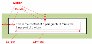
CSS Box Model Visualized

Margin and Padding Syntax

This box model applies to each and every block-level element in your HTML markup. You can assign different values for the top, right, bottom, and left values of the margin and padding properties in your CSS. Like the font properties, it is a good practice to assign margin and padding values in em units of relative measurement; however using absolute measurements in px may be suitable. Here is an example of assigning margin and padding values in CSS:
p.someclass {
margin-top: 1.5em;
margin-right: 0;
margin-bottom: 0;
margin-left: 1.5em;
padding-top: 0;
padding-right: 0.1em;
padding-bottom: 0;
margin-left: 0.1em;
}
This assigns the values uniquely, which is fine, but there is a shorthand way to do this. The equivalent declaration for the margin values above would be margin: 1.5em 0 0 1.5em;, and for the padding values the equivalent statement would be padding: 0 0.1em;. When using four values after the margin or padding property, you just need to remember TRBL (i.e. "Top-Right-Bottom-Left"). If you only have two values, such as the padding example above, the first number will be the top and bottom value, while the second number will be left and right value. It is also possible to just use one number such as margin: 1em;, which would assign the 1em margins all around the box.

Border and Background


Some new CSS concepts have been introduced in this discussion of the box model. The border is the rectangle that encompasses the padding and content section. Styling the border will be covered in more detail in the advanced CSS section, but here is a basic way to add border to your content:
p.someclass {
border-width: 2px;
border-style: solid;
border-color: black;
}
The shorthand declaration for this would be border: 2px solid black;. We will also explore more on backgrounds in the future, but for now be aware that you can set the background color with the background-color: color value; declaration, where color value is either one of the 143 predefined color names or hexadecimal code. By definition of the CSS box model, the background is underneath the border, padding, and content areas, but not the margin area.

CSS Box Model in Action


The CSS box model can be difficult to comprehend, so here is an example that will help to alleviate some confusion. In this HTML markup and content, we have three paragraphs that all have different padding and margin properties:
<p class="para1">This is paragraph #1 of the box example. It comes before paragraph #2 and has some margin and padding properties assigned to it.</p>
<p class="para2">This is paragraph #2 of the box example. It has margins but no padding.</p>
<p class="para3">This is paragraph #3 of the box example. The margins have been removed so you can see how they interact, but some padding has been added. Aren't you glad you grew up to be some schmoe working in a box factory.</p>
Some example CSS to alter the margins would be as follows:
p.para1 {
margin: 3em 0 0 3em;
padding: 0.75em;
background-color: pink;
border: 2px solid black;
}
p.para2 {
margin: 1.5em 0;
padding: 0;
background-color: cyan;
border: 2px solid black;
}
p.para3 {
margin: 0;
padding: 12px 12px 0 6px;
background-color: orange;
border: 2px solid black;
}
Example of Paragraphs with Different Margin/Padding in Chrome

Can you spot the differences in each of the paragraphs? The first box has a margin-top of 3em and a margin-left of 3em with some even padding around the content area. The second box has 1.5em margins on the top and bottom, but no margins on the left and right. Additionally, it has no padding, so the content butts right up against the border. The third box has no margins and some uneven padding. Don't be confused that the box doesn't merge right up against the browser viewing window in Chrome, because most web browsers and eReading software automatically add bit of space between the viewing window and box (with the notable exception of Adobe Digital Editions).

Here is a blown-up sample between the first and second box to help you better visualize how boxes stack on top of one another:
Example of Paragraphs in Chrome with Specifics on Sizing
Tip: To center your box, you can make the declaration margin: 0 auto;.

CSS Box Model as It Applies to eBooks on the Kindle


You may ask what happens if you get in a situation where the margin-bottom is 2em for the first box, and the margin-top is 1em for the second box. The nether region between the first and second box is sort of getting mixed signals from the CSS. Will the space between them be added up cumulatively to 3em, will it be the bigger of the two (in this case 2em), or will the software crash and the world come to an end? The answer is that most browsers and eReading devices will choose spacing between the two that is the largest (in this case, the margin-bottom: 2em; for the first box). This is the case for the Kindle Fire.

However, for e-ink Kindles and the Kindle for iOS apps, eBooks are rendered differently (yes, this is becoming a frustrating pattern). Instead of the margins collapsing into the bigger margin value, they add up cumulatively. You will learn some tricks on how to deal with this discrepancy in the subsequent section. As an example, here are two screen shots on the Kindle Fire and an e-ink Kindle with the exact same CSS and HTML. There is a margin-bottom: 2em; on box#1 and a margin-top: 2em; on box #2. Note the discrepancies in rendering:
Margins Rendered Differently on the Various Kindles

Now that you can visualize all block element tags as "boxes", it is possible to tinker with the spacing between your headings and paragraphs to highly customize the look of your eBook. In the next section, you will learn how to adjust your margins, along with indentation and alignment, to give your eBook a professional polish.

Next Section: Adjusting Indents, Alignment, and Margins
Share/Bookmark